Configurator UI
A configurator is a small UI component for one editable value or one group of values. Accessors create configurators, inspectors display them, and editors listen to their change events.
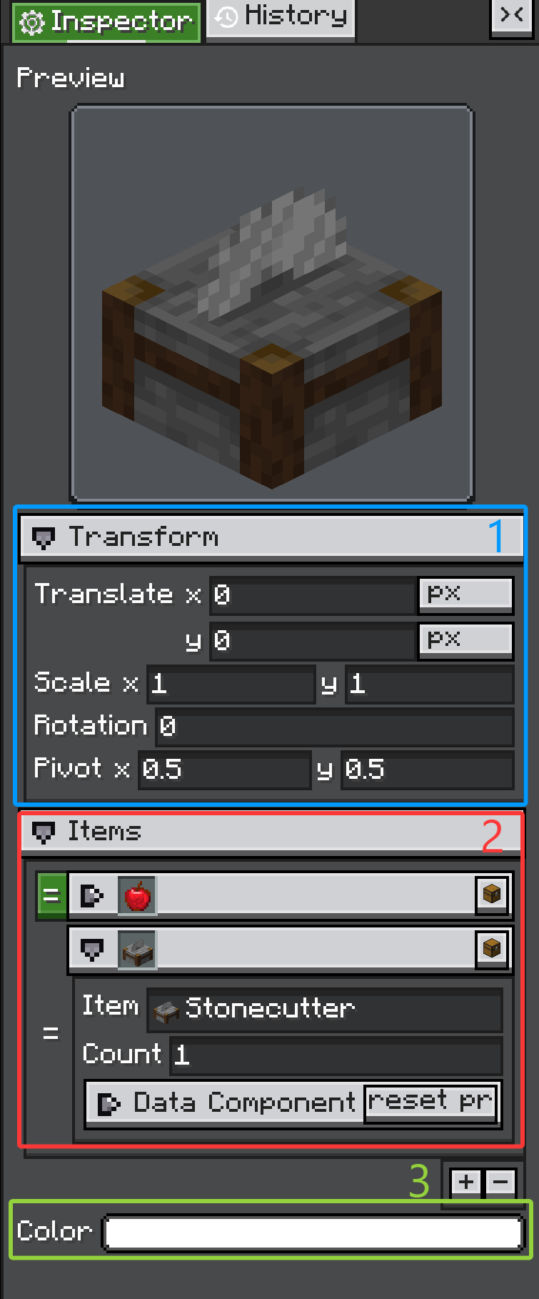
ConfiguratorGroup, 2. ArrayConfiguratorGroup, 3. regular ValueConfigurator rows.
The three marked areas are the pieces most custom editors reuse. A ConfiguratorGroup creates collapsible sections, an ArrayConfiguratorGroup edits arrays or collections, and a ValueConfigurator row edits one value through one inline control.
Configurator
Configurator is the base class. It provides:
- a label area;
- an inline content container;
- an optional tips icon;
- copy and paste context menu support;
notifyChanges();- the
Configurator.CHANGE_EVENTevent.
Most concrete configurators add their control into inlineContainer.
NumberConfigurator speed = new NumberConfigurator(
        "Speed",
        () -> model.speed,
        value -> model.speed = value.floatValue(),
        1.0f,
        true
);
When a custom configurator changes the model, call:
That event is what Inspector uses to run listeners and record history.
ValueConfigurator
ValueConfigurator<T> is the core base class for most editable property rows. It connects one UI control to one value.
Constructor arguments:
public ValueConfigurator(
        String name,
        Supplier<@Nullable T> supplier,
        Consumer<@Nullable T> onUpdate,
        @Nullable T defaultValue,
        boolean forceUpdate
)
What each part does:
supplier: reads the current value from the target object.onUpdate: writes a changed value back to the target object.defaultValue: fallback value and default paste/drop type.forceUpdate: whentrue,screenTick()refreshes the configurator fromsupplier.
ValueConfigurator separates two update directions:
onValueUpdatePassively(newValue): update the configurator's internal value and visual widget without notifying listeners.updateValueActively(newValue): user changed the widget; update value, callonUpdate, and fireConfigurator.CHANGE_EVENT.
That split matters. If your widget is refreshed from the model, use the passive path. If the user edits the widget, use the active path.
protected void onSliderChanged(float value) {
    updateValueActively(value);
}

@Override
protected void onValueUpdatePassively(Float newValue) {
    super.onValueUpdatePassively(newValue);
    slider.setValue(newValue == null ? defaultValue : newValue, false);
}
It also provides copy/paste and drag-drop hooks:
setCopiable(...)setPastable(...)canDropObject(...)onDropObject(...)
Most simple custom configurators should extend ValueConfigurator<T>, not Configurator directly.
ConfiguratorGroup
ConfiguratorGroup contains other configurators. It is used for class-level @Configurable, nested subConfigurable fields, and manual sections.
ConfiguratorGroup display = new ConfiguratorGroup("Display", false);
display.addConfigurator(new StringConfigurator("Name", () -> name, v -> name = v, "", true));
father.addConfigurator(display);
Groups can be collapsed. @Configurable(collapse = ..., canCollapse = ...) maps to the same behavior when the group is generated by annotations.
ArrayConfiguratorGroup
Arrays and collections use ArrayConfiguratorGroup. The group owns a list of child configurators, and can allow add, remove, and reorder operations.
@ConfigList is the normal way to tune this behavior:
@Configurable(name = "Entries")
@ConfigList(canAdd = true, canRemove = true, canReorder = true)
public List<Entry> entries = new ArrayList<>();
Common Concrete Configurators
You will usually see these classes from accessors or custom panels:
| Type | Class | Description |
|---|---|---|
| Boolean | BooleanConfigurator |
Toggle-style editor for boolean / Boolean. |
| Number | NumberConfigurator |
Text-field based numeric editor with range and mouse-wheel step support. |
| String | StringConfigurator |
Single-line text editor; can be restricted to resource-location syntax. |
| Text area | TextAreaConfigurator |
Multi-line text editor. |
| Color | ColorConfigurator |
Integer color picker, usually selected by @ConfigColor. |
| HDR color | HDRColorConfigurator |
High dynamic range color editor. |
| Selector | SelectorConfigurator |
Dropdown-style selector for fixed candidates, often enums. |
| Toggle selector | ToggleSelectorConfigurator |
Compact selector using toggle/icon style candidates. |
| Conditional selector | ConfiguratorSelectorConfigurator |
Selector that also rebuilds a child ConfiguratorGroup for the selected value. |
| Search | SearchComponentConfigurator |
Search field for large or dynamic candidate sets. |
| Registry search | RegistrySearchComponent |
Search UI for Minecraft registry values. |
| Tag key | TagKeySearchComponent |
Search UI for tag-key style values. |
| NBT/tag | TagConfigurator |
Editor for NBT Tag values. |
| Data component | DataComponentConfigurator, TypedDataComponentConfigurator |
Editors for Minecraft data component values. |
| Texture | IGuiTextureConfigurator |
Chooses and configures registered IGuiTexture implementations. |
| Renderer | IRendererConfigurator |
Chooses and configures registered IRenderer implementations. |
| Transform reference | TransformRefConfigurator |
Scene-editor transform reference editor. |
| Layout value | LengthPercentConfigurator, LPAConfigurator, DimensionConfigurator |
Editors for layout-related numeric/unit values. |
| Optional float | FloatOptionalConfigurator |
Float editor that can represent an empty optional value. |
| Group header | HeaderConfigurator |
Non-value header row used to separate sections. |
| Array/list | ArrayConfiguratorGroup |
Add/remove/reorder editor for arrays and collections. |
Do not start with manual UI for every field. Let annotations and accessors handle ordinary properties, then add manual configurators only where the editor needs custom behavior.
Custom Configurator
Create a custom configurator when one value needs a special widget. The pattern is:
- extend
ValueConfigurator<T>; - create the UI control and add it to
inlineContainer; - when the user changes the control, call
updateValueActively(value); - override
onValueUpdatePassively(...)to refresh the control when the model changes; - optionally expose copy, paste, and drag/drop behavior.
public class ToggleNameConfigurator extends ValueConfigurator<Boolean> {
    private final Toggle toggle;

    public ToggleNameConfigurator(
            String name,
            Supplier<Boolean> supplier,
            Consumer<Boolean> onUpdate,
            Boolean defaultValue,
            boolean forceUpdate
    ) {
        super(name, supplier, onUpdate, defaultValue, forceUpdate);
        setCopiable(value -> value);

        toggle = new Toggle();
        toggle.toggleLabel.setText("");
        toggle.setOn(value == null ? defaultValue : value, false);
        toggle.setOnToggleChanged(this::updateValueActively);

        inlineContainer.addChild(toggle);
    }

    @Override
    protected void onValueUpdatePassively(Boolean newValue) {
        if (newValue == null) newValue = defaultValue;
        if (newValue.equals(value)) return;
        super.onValueUpdatePassively(newValue);
        toggle.setOn(newValue, false);
    }
}
Use it manually:
father.addConfigurator(new ToggleNameConfigurator(
        "Enabled",
        () -> model.enabled,
        value -> model.enabled = value,
        true,
        true
));
Or return it from an accessor:
@Override
public Configurator create(
        String name,
        Supplier<Boolean> supplier,
        Consumer<Boolean> consumer,
        boolean forceUpdate,
        @Nullable Field field,
        @Nullable Object owner
) {
    return new ToggleNameConfigurator(name, supplier, consumer, true, forceUpdate);
}
Extend Configurator directly only for UI that does not represent one value, such as a header, action row, preview panel, or compound editor that manages several children itself.
Copy And Paste
Configurator can expose copy and paste actions in its right-click menu.
configurator
        .setCopiableDirect(model.value)
        .setPastable(Value.class, value -> {
            model.value = value;
            configurator.notifyChanges();
        });
This is useful for repeated editor data such as colors, vectors, textures, and renderer settings.