
Resource UI
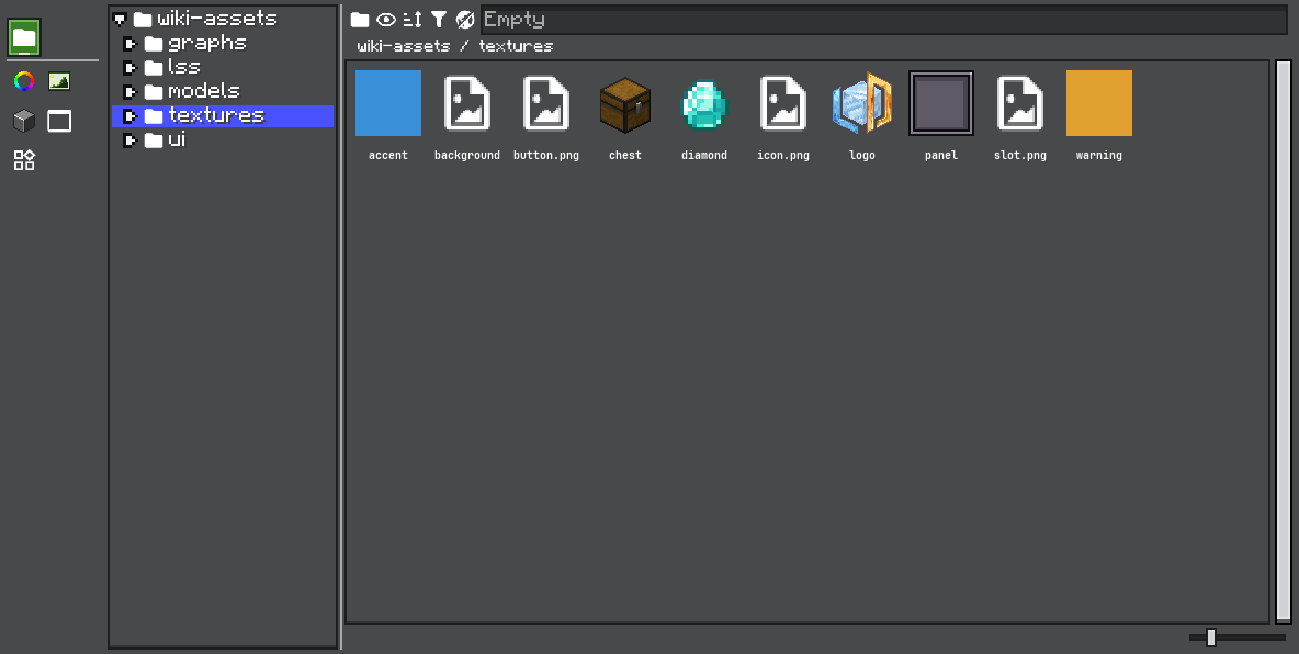
The resource panel has four main areas:
Resource type tabs
Each tab switches to a differentResource<?>type, such as textures, colors, UI templates, or your own project resource type. The Assets tab, pinned in front, opens the Asset Browser.Built-in resource providers
These are providers registered by code. Built-in resources are usually examples, defaults, or internal assets. They are normally read-only.Additional resource providers
These are extra providers added by users or projects, such as file-backed folders. Use this area for editable user resources.Resource contents
This is theResourceProviderContainercontent area. It displays the resources from the selected provider and handles selection, editing, dragging, copying, renaming, and removal.
The resource panel is built from three layers.
ResourceView is the built-in editor view. It creates one tab per Resource<?> type after the pinned Assets tab, and stores the selected ResourceInstance.
ResourceContainer<T> is the content for one resource type. The left side lists providers. The right side shows the selected provider's resources.
ResourceProviderContainer<T> renders the resources from one provider.
Tab Strip
Since 2.2.41Users arrange the resource tab strip themselves:
- drag the seam between the strip and the content to resize the strip,
- drag a tab along the strip to reorder it,
- right-click the strip → Tab Strip to put it on the left (default), right, top, or bottom,
- Visible Tabs hides or shows individual resource types,
- Fit Tabs to One Line hands the thickness back to the theme, and Reset Tab Layout restores everything.
A thicker strip holds several lines of tabs: they wrap onto the next line once there is room for one. Tabs that still do not fit scroll with the mouse wheel.
The arrangement is saved per editor class in ldlib2/editor_layouts/resource_views.nbt. Override ResourceView#layoutKeyOf(Editor) to share one arrangement between editors, or to give an editor created many times a stable key. The same settings are available in code through setPlacement(...), setStripSize(...), fitStripSize(), and resetTabLayout().
Provider UI
Each provider supplies a toggle via IResourceProvider.createProviderToggle(). File providers add an open-folder button. Built-in providers use a read-only resource icon.
Right-clicking the provider list can create custom providers for registered ResourceProviderTypes that support custom instances.
Resource UI
ResourceProviderContainer supports:
- grid and list display,
- selectable items,
- double-click edit,
- drag payloads,
- copy path,
- add resource,
- copy resource,
- rename resource,
- remove resource,
- provider-specific context menu entries,
- search and sort (2.2.42).
Copy and Duplicate
Changed 2.2.38Copy Resource To opens a dialog that asks for a destination and a name. The destinations are every writable provider of the resource type, not only the current one, so a resource from a read-only built-in library can be copied somewhere editable. The copy is undoable.
To copy in place without a prompt, call duplicateResource(path). It writes a _copy resource into the same provider. copyResource(path) is the dialog version.
Open Without Editing
Since 2.2.38canOpen decides whether double-clicking opens a resource at all. canEdit decides whether it can be changed. By default canOpen follows canEdit.
A resource type whose editor has a read-only mode can widen canOpen. The menu entry then reads View instead of Edit for resources that cannot be edited:
container.setCanOpen(path -> true);UI templates and graphs do this, so built-in templates and graphs open read-only.
Search and Sort
Since 2.2.42The toolbar has a search field that filters the provider's resources by name, and a sort button. Sort modes are in Resource.SortMode: DEFAULT (the provider's own order), NAME, MODIFIED, and SIZE. MODIFIED and SIZE are offered for file providers only. The sort mode and direction are stored on the ResourceInstance, so they apply to every provider of that type.
| Method | Description |
|---|---|
setSearchText(String) / getSearchText() | Sets or reads the search text. |
matchesSearch(path) | Whether a resource passes the current search. |
setSortMode(Resource.SortMode) | Changes the sort mode. |
setSortAscending(boolean) | Changes the direction. |
Use these hooks to customize behavior:
container.setAddDefault(() -> new ShopEntry());
container.setOnEdit((view, path) -> openShopEntryEditor(path));
container.setOnMenu((view, menu) -> menu.leaf("shop.validate", this::validate));
container.setOnDragProvider(path -> resourceProvider.getResource(path));
For type-level customization, override:
@Override
public ResourceProviderContainer<ShopEntry> createResourceProviderContainer(IResourceProvider<ShopEntry> provider) {
    return new ResourceProviderContainer<>(provider)
            .setAddDefault(ShopEntry::new)
            .setOnEdit((container, path) -> edit(container, path));
}
Resource edits should usually go through HistoryView, so undo and redo work like other editor actions.
Customize the Display
Use setUiSupplier(...) to render each resource item.
@Override
public ResourceProviderContainer<ShopEntry> createResourceProviderContainer(IResourceProvider<ShopEntry> provider) {
    return super.createResourceProviderContainer(provider)
            .setAddDefault(ShopEntry::new)
            .setUiSupplier(path -> {
                var entry = provider.getResource(path);
                return new UIElement()
                        .layout(layout -> {
                            layout.widthPercent(100);
                            layout.heightPercent(100);
                        })
                        .addChild(new Label().setText(entry == null ? "missing" : entry.displayName()));
            });
}
ColorsResource uses this to draw a color rectangle. TexturesResource uses it to draw the texture itself.
Customize Editing
Use setOnEdit(...) for double-click editing or context-menu edit commands.
.setOnEdit((container, path) -> {
    var entry = provider.getResource(path);
    if (entry == null) return;

    container.getEditor().inspectorView.inspect(entry, configurator -> {
        container.markResourceDirty(path);
    });
})
For edits that replace the resource value, push a history action:
container.getEditor().historyView.pushHistory(
        Component.translatable("shop.edit_entry"),
        EditAction.of(
                () -> {
                    provider.addResource(path, newEntry);
                    container.reloadSpecificResource(path);
                },
                () -> {
                    provider.addResource(path, oldEntry);
                    container.reloadSpecificResource(path);
                }
        )
);
Customize Dragging
Use setOnDragProvider(...) when dragging a resource should provide a different object than the raw resource value.
.setOnDragProvider(path -> new ShopEntryReference(path))TexturesResource uses this pattern to drag a UIResourceTexture reference instead of directly dragging the texture object.
Customize the Context Menu
Use setOnMenu(...) to add resource-specific commands.
.setOnMenu((container, menu) -> {
    if (container.getSelected() != null) {
        menu.branch("shop.copy", branch -> {
            branch.leaf("shop.copy_path", () ->
                    ClipboardManager.INSTANCE.copyDirect(container.getSelected().getPathWithType()));
            branch.leaf("shop.copy_id", () ->
                    ClipboardManager.INSTANCE.copyDirect(container.getSelected().getResourceName()));
        });
    }
})
Keep resource UI behavior close to the Resource<T> subclass when it is part of the resource type itself. Use provider hooks when the behavior depends on where the resource comes from.