
Slider
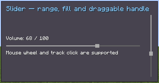
Since 2.2.33Slider selects a float in a [min, max] range. It is the value-picking counterpart to Scroller: its handle has a fixed size, while a scroller handle represents viewport size. Two concrete variants are registered:
slider-horizontal— horizontal slider, 7 px high by default.slider-vertical— vertical slider, 7 px wide by default.
Dragging the handle, left-clicking the track, or using the mouse wheel changes the value. Slider extends BindableUIElement<Float>, so it can use normal data bindings.
INFO
Everything documented on UIElement applies here too: layout, styles, events, and data bindings.
Usage
var volume = new Slider.Horizontal()
        .setRange(0f, 100f)
        .setValue(40f)
        .setOnValueChanged(value -> saveVolume(value));
volume.sliderStyle(style -> style.sliderStep(0.05f));
parent.addChild(volume);

var vertical = new Slider.Vertical().setRange(-1f, 1f);XML
<slider-horizontal min-value="0" max-value="100" value="40"/>
<slider-vertical min-value="-1" max-value="1" value="0"/>| XML attribute | Type | Description |
|---|---|---|
min-value | float | Minimum value. Default: 0. |
max-value | float | Maximum value. Default: 1. |
value | float | Initial value. Default: 0. |
Internal Structure
| Field | CSS class | Description |
|---|---|---|
trackContainer | .__slider_track_container__ | Full hit area; receives track clicks and wheel events. |
track | .__slider_track__ | The thin background line. |
fill | .__slider_fill__ | Filled line from minimum to the current value. |
handle | .__slider_handle__ | Fixed-size draggable Button. |
Slider Style
INFO
slider-step
Fraction of the full range moved by one mouse-wheel notch. Default: 0.1.
slider.sliderStyle(style -> style.sliderStep(0.05f));INFO
slider-track-size
Track thickness in pixels. Default: 1.
slider.sliderStyle(style -> style.trackSize(2));INFO
slider-handle-size
Handle length along the track in pixels. Default: 3.
slider.sliderStyle(style -> style.handleSize(6));Value Binding
slider.bind(DataBindingBuilder.floatVal(
        () -> state.getVolume(),
        value -> state.setVolume(value)
).build());
See Data Bindings for sync strategies and lifecycle rules.
Fields
| Name | Type | Access | Description |
|---|---|---|---|
trackContainer | UIElement | public final | Full slider hit area. |
track | UIElement | public final | Background line. |
fill | UIElement | public final | Filled value line. |
handle | Button | public final | Draggable handle. |
sliderStyle | SliderStyle | private (getter) | Current slider style. |
minValue / maxValue | float | protected (getter) | Current range endpoints. |
isDragging | boolean | protected (getter) | true while dragging the handle. |
Methods
| Method | Returns | Description |
|---|---|---|
setRange(float, float) | Slider | Sets the range and clamps the current value. |
setMinValue(float) / setMaxValue(float) | Slider | Changes one range endpoint. |
setValue(Float) | Slider | Sets the clamped value and notifies listeners. |
setValue(Float, boolean) | Slider | Sets the value; pass false to suppress notification. |
setNormalizedValue(float) | Slider | Sets a normalized 0..1 position. |
getNormalizedValue() | float | Gets the normalized position. |
slideValue(float) | void | Moves by a normalized range fraction. |
setOnValueChanged(FloatConsumer) | Slider | Registers a value listener. |
sliderStyle(Consumer<SliderStyle>) | Slider | Configures style fluently. |
trackContainer(...), track(...), fill(...), handle(...) | Slider | Configures internal elements. |